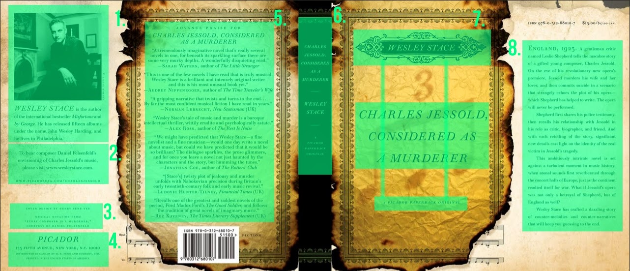
Cover 1:
1.Black and White image contrasting with colour background.
2.Author name bigger than other text about the author
3.Black text on background
4.'Picador' is bigger than other text
5&6.Yellow background and black border contrasting black background and yellow border
7.Yellow text on black background and different type sizes
8.Author name yellow with design and title and sub title are black on yellow background, also different sizes
9.Slight colour change on the 3 to background.
10.Black music notes on yellow background also contrast the border.
11.Some text larger than the other text.
Repetition:
1.Same typeface and same colour as most of the other text
2.Repetition of burnt edges of the book cover.
3.Same typeface, colour and size.
4.Repetition of the notes in the bottom corners.
5.Border throughout the front, spine and back.
6.Same typeface and colour.
7.Same typeface and colour.
8.Same background colour on the flaps.
Alignment:
1.Picture lines up with text about author and publishing company info.
2.Bottom of info on left flap aligns with bottom of text on right flap.
3.Border aligns with music notes and bottom of barcode.
4.Center aligned text on the back.
5.Border aligns at the top
6.Center aligned text on spine
7.Center aligned text on front.
8.Last bit of text from left flap carrying on to the right flap aligns with the rest of the text.
9.Bottom of text on right flap aligns with top of bar code.
1.Image is in proximity with the text about author
2.Publishing company info in proximity with each other.
3.Website for book in proximity with text about the book.
4.Publishing company name in proximity with info.
5.Publishing company name in proximity with info.
6.Body text of the back all in proximity with each other
7.Title, author and subtitle even though far apart are still in proximity with each other.
8.Text on right flap all in proximity with one another
Cover 2:
Contrast:
1.Contrast between different colour text and also size difference. Also black and white photo on colour background
2.Different colour text and also different size
3.Black background with white effect
4.Blue text in black background
5.Images off all the social media sites instead of text
6.Blue text instead of all white text
7.Blue and white text instead of just one colour
8.Contrast of different sizes and also kerning on text at the top of the back, contrasting normal text
9.Size difference between title and author, also colour and the title is vertical where the other text is horizontal
10.Contrast of non edited image to edited image
11.Size and horizontal text contrasting vertical, bigger title.
12.Black text for author name instead of white.
13.Blue text for publishing company logo
14. Different size, colour, typeface and kerning on blue text.
Repetition:
1.Repetition of black and white.
2.Use of images for social media sites
3.Images for all types of social media sites.
4.Repetition of blue text, typeface and size.
5.Blue text for reviewer and white text for the actual review
6.White main text, same typeface and size.
7.same title used for spine and front also at same angle.
8.Publishing company logo same colour
9.Same image used twice
10.Same typeface, colour and size.
11. Same typeface and same angle as title.
Alignment:
1.Image of author aligns with text on right flap
2.Text on left flap aligns with each other.
3.Images for social media aligns with bar code.
4.Text on back align with each other
5.Top of text on back aligns with top of text on right flap
6.Second paragraph on back aligns with second paragraph on right flap
7.Title, author and publishing company logo all lien up.
8.Bottom of bar code aligns with bottom of publishing company logo on spine and right flap
9.Start of author name and the word point align with one another
10.Top of the image for the author aligns with the top of the images on the front.
11.Text on right flap line up
12.Text at the bottom of left flap are center aligned
12.Reviews on the back are center aligned.
Proximity:
1.Image of author and text about author in proximity
2.Twitter link in proximity with logo
3.Info in proximity with each other
4.Excerpt from the book in proximity with the other excerpt
5.Reviews all in proximity with each other
6.All the logo's in proximity with each other and also the website.
7.Author name, publishing company logo and title all in proximity
8.Title, author name and sub title in proximity
9.Main text ob right flap all in proximity, where the other text and logo are not.


No comments:
Post a Comment